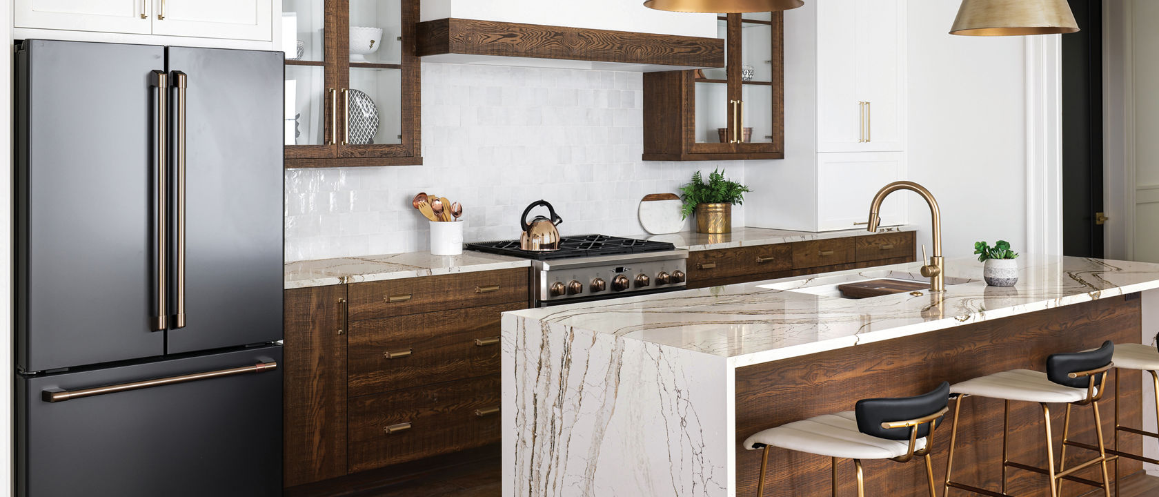
Contrasting materials can keep wood cabinets from feeling dark and dreary. Here, the copper-and-brown-veined Cambria Clovelly™ adds a bright note and repeats the pattern of the cabinets’ wood grain. Photography by Tim Furlong Jr.
1. Cozy and Bright
Rich, warm tones are back in full force, but the best-dressed kitchens keep the look fresh and light by balancing wood finishes with plenty of white. Home builder Jason Black and his wife, interior designer Gretchen Black, took this approach to the kitchen of a new home in Louisville, Kentucky. “We painted the backs of the cabinet interiors white and incorporated glass into the doors,” says Gretchen. “All the white keeps the look light, and also emphasizes the texture of the stained oak.”
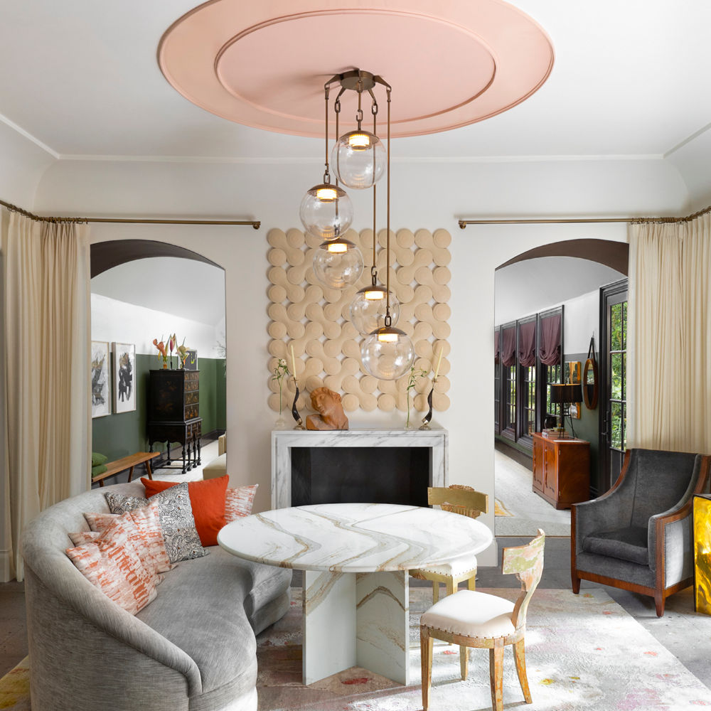
A tight palette of rose, terracotta, and merlot—complemented by luminous whites and creams—creates a soft and soothing effect that transitions beautifully from dawn to dusk. Cambria design shown: Brittanicca Gold Warm™. Photography by Aaron Dougherty
2. Lush Layers
Luxurious but not over-the-top: It’s a surprisingly difficult line to walk, but designer Marcus Mohon does so with grace. Perhaps that’s because he starts a project by thinking about how he wants his clients to feel: “I’ve always been very concerned with the warmth of a space,” he says. Mohon isn’t talking about temperature, but about the soothing effect a room can have. Here he relies on layers of contrasting textures—plush seating, sheer window panels, smooth Cambria Brittanicca Gold Warm surfaces, and three-dimensional artwork—to achieve it.
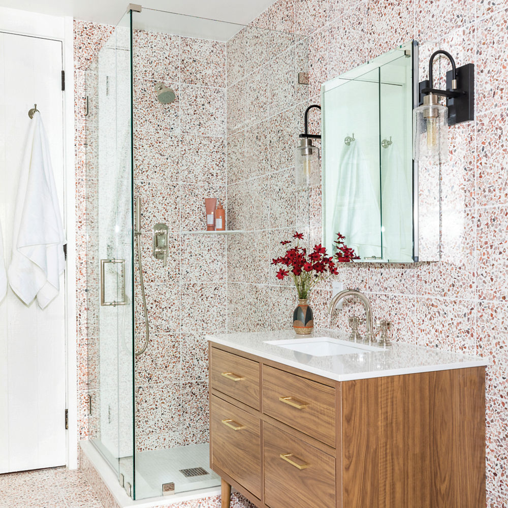
Dense patterns like this terrazzo tile need simple elements to provide balance and contrast, like the pure white relief of Cambria White Cliff® on the vanity countertop. Photography by Julie Soefer
3. Vintage Revamped
“Anytime you remodel in an older space, you want to honor its style but bring new, purposeful life to it,” says designer Marie Flanigan, who updated this circa-1970s bath with design partner Melanie Hamel. The pair took inspiration from the clean lines of midcentury style for the design of the vanity, but went all out with the floor-to-ceiling earth-tone terrazzo tiles. “I love to push the boundaries,” says Flanigan.
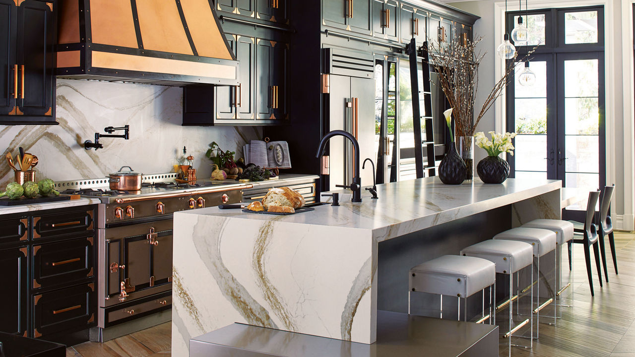
Lustrous elements—metallic hardware, a gleaming range hood, a dimensional countertop choice like Cambria Brittanicca Gold Warm—can add life and sparkle to a space with dark cabinets or walls. Photography by Gieves Anderson
4. Dark and Dramatic
Black cabinets have been having a moment. The finish can complement a wide range of design styles, including the look designer Vanessa DeLeon wanted for her own space: “minimalism meets glamour.” Deleon knew that adding the gleam of warm metallic hardware and accents would help her create that nuanced look, and she was initially drawn to gold finishes. But, ultimately, “I decided copper and black would be more unique,” she says. Decision made, Deleon went big with the effect, even designing a black-trimmed copper range hood.
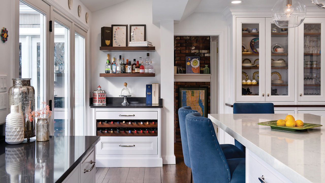
Tucking a wine bar into a corner adds entertaining appeal outside of the main flow of food-prep traffic. The Cambria Charlestown™ design contrasts smartly with the lighter island counter. Photography courtesy of Bakes & Kropp
5. Made for Entertaining
Today’s kitchens need to be efficient cooking spaces, of course, but they’re also prime gathering and entertaining centers. So, designers like Mary Dimichino take care to build in flexibility. A kitchen usually has to function for at least two people cooking and cleaning up at the same time,” she says. To provide adequate work space, she installed a large island topped with Cambria Sutherland™ in this project, as well as a wine bar. “The island doubles as a dining table and provides adequate prep space,” says Dimichino.
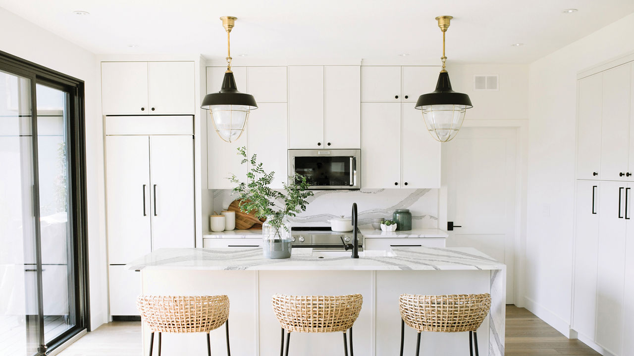
Liberal doses of white in the kitchen reflect light from the glass doors, seamlessly linking the space with the outdoor living areas. Accents of black and natural wood and rattan strike a sophisticated, organic note. Cambria design shown: Brittanicca™ Photography by Ariana Tennyson.
6. Elegant Organic
Creating a strong indoor-outdoor connection is one of the surest paths to make a space feel at once fresh and nurturing. Designer Jaclyn Peters did just that in this Canadian kitchen, bringing nature into her design with exposed wood beams, woven rattan stools, and the bold natural texture of Cambria Brittanicca on the countertops. “Focusing on warmer tones and rich textures made everything feel very cozy,” says Jaclyn.
[Updated on 12/05/2023]
Discover More
Get our beautifully curated collection of lifestyle stories, interior design trends, and expert advice sent straight to your home and email inbox with a complimentary subscription to Cambria Style magazine.
Ready to explore Cambria quartz designs in person? Contact a Cambria consultant or use our retail locator to find a professional in your area for project support and planning, material selection, or visualizing what’s possible.
Explore the #MyCambria Gallery to see how others transformed their spaces and follow us on social media.
Get the Look
Explore the designs featured in this story.


